I’ve had a slow couple of months business-wise, but the benefit of that is I can work on my own projects. I am happy to report that I have just completed a new website for myself. My WordPress blog (you are here) has not changed, but you will notice that my top-level site has been updated to be completely mobile-compatible using modern day technologies. My previous site used Flash for its primary experience and did have a mobile-compatible fallback but this was never ideal, especially as today’s browsers are making it more difficult to use Flash.
So—the new site is built using the UFront framework. This is a very interesting and useful tool because it uses the same Haxe source code which compiles for both client (Javascript) and server (PHP). The framework is able to cache resources such as the site template, and it builds pages client-side whenever possible. It will remotely load only the data it needs to build each new page. The result is that the site is super fast. If you watch your network activity as you browse my portfolio, you will see that each new page requires only a few kilobytes, and browsing previously viewed pages will have nearly no network activity at all. If JavaScript is disabled, the site looks identical and pages will be built server-side instead.
For graphics, the site detects high-resolution (e.g. “Retina”) devices and serves high resolution images to them if they are available on the server. The top-level site navigation features a single SVG graphic for the menu. The graphic is embedded in the site template, where it serves as a graphic library allowing me to have the same display code used for both the menu and the headers. Animation effects are achieved using only CSS3 transforms, which saves the user from having to download any JavaScript libraries.
Something I wish was different is that Webkit-based browsers like Chrome and Safari for desktop don’t render fonts nicely when perspective transforms are applied to page elements. I was able to remedy this fairly easily for portfolio items, but pages at the second level of my hierarchy are a bit fuzzy. My hope is that these browsers make improvements which remedy this for me.
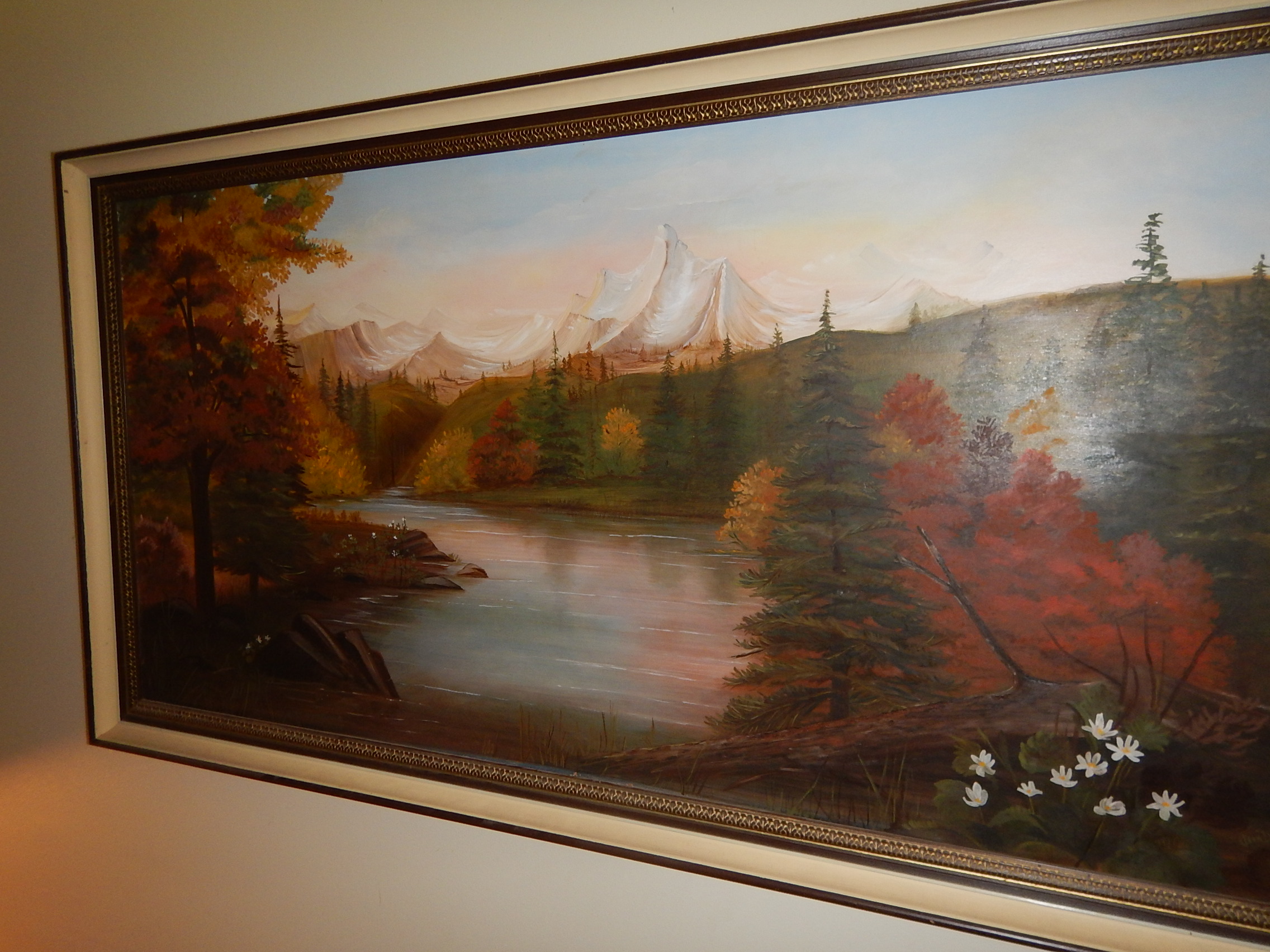
I have an oil painting hanging in my home—a landscape of a lake reflecting the sunset that burns beyond a far-off mountain. I know enough about art to know that it is mediocre in terms of execution, style and composition. However I love the painting dearly because whenever I see it I am reminded of my grandmother who painted it.
Oil Painting by Jean Dowdeswell
I reflect on this and wonder what my children will have to remember me by. I dabble in music, poetry, writing, photography, illustration and artwork. I’ve produced a lot of things professionally over the years in both graphic design and programming. Yet a large percentage of my stuff is in digital form, and this worries me a bit. I see these problems:
Storage media becomes obsolete and incompatible much too rapidly, and it deteriorates over time.
File formats, especially interactive media, also become obsolete very rapidly.
Online storage services aren’t bulletproof and access can be lost due to human error.
If I die, who will be willing and able to track down all of this stuff I’ve stored in various places?
Right now, my solution to the above problems is eclectic. I try to keep most stuff on my one computer and to keep a reliable hard drive backup. Right after I’m done this article, I intend to review whatever instructions are left for accessing this and my other things which are stored online. Just like I told myself last year. And every year before.
What about code?
I will admit that when I write code, my primary goal is for it to be useful right now for the task at hand. I can’t help but wonder however whether my code will be useful many year from now.
In a nutshell, I see that code written in Haxe is going to have a very strong likelihood of being useful many years from now, no matter what other technologies come along.
But let’s gain a larger perspective on these issues:
Does any of this matter, and will anyone care?
I went to a presentation by Stefan Sagmeister a few months ago, and he talked a lot about happiness. He had some good insights about how to be happy, but it left me wondering: is that what life is about? Does it do any good to pursue happiness during this lifetime when it is just a speck on the timeline of eternity? His show was preceded by a presentation by the wonderfully talented Brian Kachur who made the point that creative people need to spend less time worrying or grumping, and more time making “cool shit”. That resonated with me a bit more than Stefan’s presentation, and it got me reflecting more on the meaning of it all.
Why is stuff cool? It seems to me that it’s about the audience and not yourself. I’ve joked before that I can be cool all by myself at home, but I don’t really believe it. Something is cool because it is judged to be so by others. We have a relationship with and obligation to the audience of whatever we make. I also believe that when we are focused on serving others, we are more likely to forget our own problems and therefore more likely to be happy. But happiness must not be the end goal.
Because it can entertain and inspire, communication design is an opportunity to do good. It is being good that will make people remember you and love you. That’s why I love my grandmother’s painting—it is because I loved her and it helps me remember her.
I want to take this idea yet another step further. I mentioned about our audience judging our works to be cool or good. Will we have the same audience many generations from now? I think about how much I know about my great-great-grandparents and I have to answer no. There is only one judge left after that amount of time, and I know my works will be remembered and written in his book forever. With no data loss.
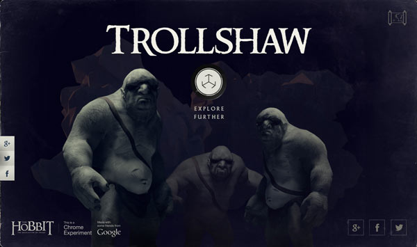
I was excited to see what the folks at MGM/Warner would come up with to promote the new movie The Hobbit: The Desolation of Smaug. HTML5 nowadays has some very interesting features so I wanted to see what a studio could accomplish with their truckloads of money. So naturally when “A Journey Through Middle Earth” got published, I ran to check it out. Clicked, I mean. Click-ran.
The first thing I encountered upon visiting the site was that I needed to use the Chrome browser instead of my normal Firefox. This wasn’t a big deal to me because I understand that Chrome often has features that aren’t available yet on other browsers. Once in Chrome, I clicked the Begin button and waited. A long time. For the stuff to load. I’ve done my own bandwidth-heavy projects before, so I understand that the creative vision sometimes outweighs the technical limitations.
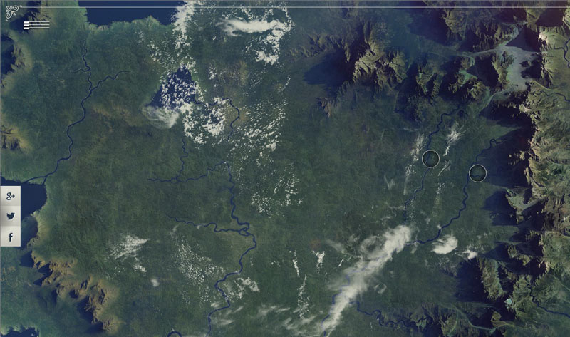
Finally, yay!—I got an interactive map of Middle Earth. I was impressed with the photorealism and nice floaty clouds. Nice music too. Hey, what’s that thing in the left corner? Oh, a slideout menu, nice. I click a circle and the map zooms in. Nothing else happens. Should I click it again? There ya go, now it links to something.
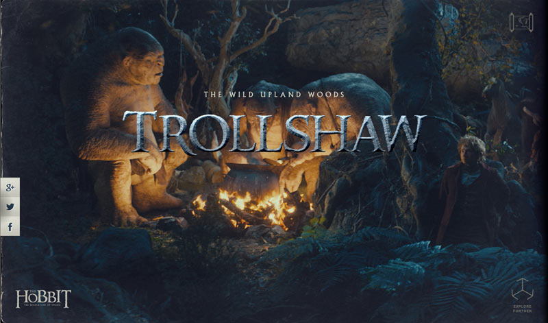
I visited the Trollshaw area first. Nice graphics. I notice that the browser address bar has changed. Ungh…more page loading. Can I click the browser’s “back” button to return to the map screen? Nope. What about that little map icon in the top right? Nope, that seems to be broken.
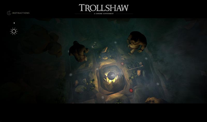
So I wait for the page load and try it out. Hey, where did my side menu go? Oh, whatever. I drag the screen as the instructions explained, and it has a nifty movie-scrubbing effect used in combination with some parallax scrolling. The site seems to assume that users have a touch screen, so I (with my laptop’s trackpad) am immediately fumbling to click and drag to the side. The imagery has been high-quality up till this point. Maybe worth the download time and only slightly gimmicky.
On the last page I find some more trolls—are these the same ones I just scrolled by? They look kinda different. I click “Explore Further”. It doesn’t work. So I reload the page and navigate back there, then it does the download.
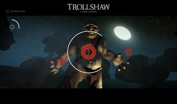
Now I have a 3D game where I am told to use my arrow keys (assumes user has a keyboard) and “swipe to run” (assumes user has a mouse or touchscreen). I start with the arrow keys, having no clue where I’m supposed to run. Suddenly I’m confronted by a troll moving in slow-motion. Oh, I think, this must be the part where I switch to the gesture controls! Wham! He nails me. I got killed a few times doing this with the trackpad and finally had to plug in a USB mouse before I could get anywhere. Then I discover it’s super easy to finish the game. They show the obligatory social media links at the end of course.
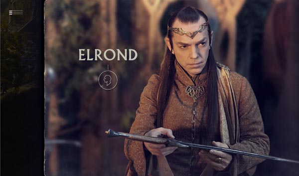
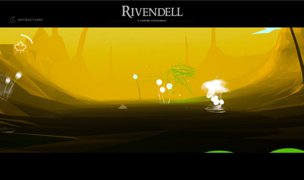
I visited the “Rivendell” page next. A very long page load this time. More click-dragging, movie scrubbing and parallax. I drag to the right before Gandalf is done talking. Clicking Elrond’s button makes him start talking at the same time, which seems awkward. He didn’t even say “pardon me”.
I get to the end of the scrolling and click “Explore Further”. Another 3D interactive thing. For a second time I am struck by how different the 3D engine graphics look from the preceding experience.
My task now is (are you ready?) to zoom through 3D space and swish my mouse over the little flowers in the valley. Really? Of all the things Middle Earth has to offer, I get to swish my mouse around? I laughed when I got to the end screen: “You made the most of your time in Rivendell.” Wow, these guys know how to party.
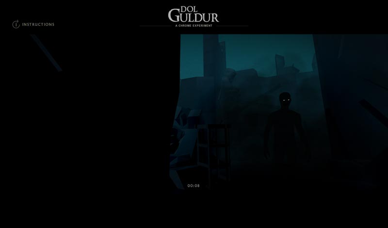
See those glowy eyes? That’s the Necromancer I guess.
On to Dol Guldur. More download, scrubbing and parallax. I click to the game and once more I have to use both my keyboard and mouse. I walk 5 steps (I counted) and try to look around with my mouse. Some unseen thing roars at me, I spin around and apparently I am dead. I try this again several times. I only achieved another five seconds and the privilege of seeing the dark figure who is destroying my hair-do. I give up, wondering how much development time it took.
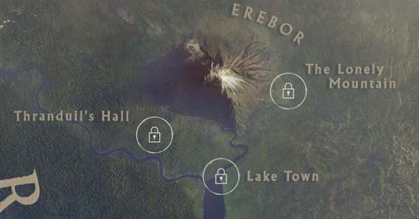
Back to the map, it appears that three other locations are supposed to be part of this site, but they are locked. They don’t tell you if they are “coming soon” or if I need to make some sort of achievement to unlock them. At this point, I really don’t care to see more.
It started off great with the map, but the rest of the site leaves me thinking that it doesn’t do much to promote the Hobbit movies, which should have been the end result. It contained absolutely nothing about the new movie, and not enough from the first movie. I would rather have seen more content-related things, like character-related information, better sound and video clips. Factor in the errors and interface difficulties, and I leave the site rather disappointed.
I think before starting such a project a development team would do well to take a page out of Nintendo’s play book, meaning that the user experience needs to take precedence over raw technical achievements. Plan the site carefully before attempting any gaming or other experience. Consider the average user and what they are expecting. Test it lots before launching it.
I hate to be so negative, but a site like this seems to be less about the user experience and more about “what can we do using WebGL”. This certainly isn’t the first site that has suffered from this problem. I just wish it wasn’t a site for the Hobbit movies, because I was expecting more.