Confidant Communications has been operating for 15 years now, so I compiled some snapshots from each year since 2009. Enjoy!
2009 Hands On Website
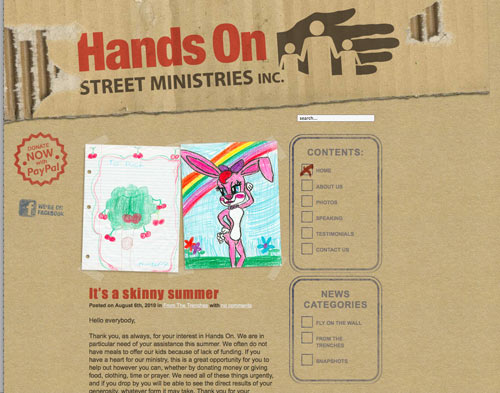
Hands On was a place where kids from the streets could find shelter and have fun. Working with the “shipping box” aesthetic for various parts of the design was a lot of fun, and it let us feature images drawn by the kids who went there!
2009 Treacherous Book Design
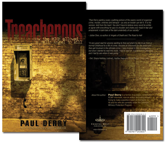
This was a highlight for Confidant because it won a Saskatchewan Premier’s Award in the graphic design category. Never mind there was just one other competitor in the category. We don’t talk about that.
2010 ThinkSask.com
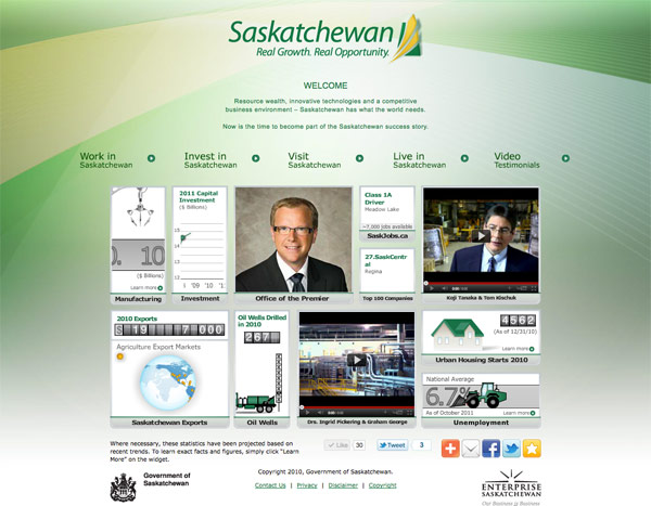
It was so much fun to do this! The site started as a Flash application (you remember Flash, don’t you?) and then was converted using the Haxe language. At the time Haxe was a new tool in our box but it worked exceedingly well for this project. Animation for HTML5 required exporting individual frames from Flash and then assembling them into sprite sheets with an automated process.
2011 WaposBay.com
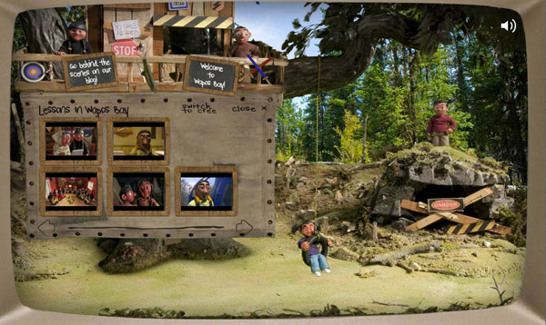
A thrilling project both for technical and aesthetic reasons, the Wapos Bay site was its own world of stop-motion characters from the Canadian TV show. It required bringing together many different transparent videos which would play at random and/or interact with the user input. I built an application that managed all the special conditions on what animations were allowed to play and when. Careful attention had to be paid to smart asset loading because bandwidth in 2011 was much more limited than it is today.
2012 Bring Niko Home
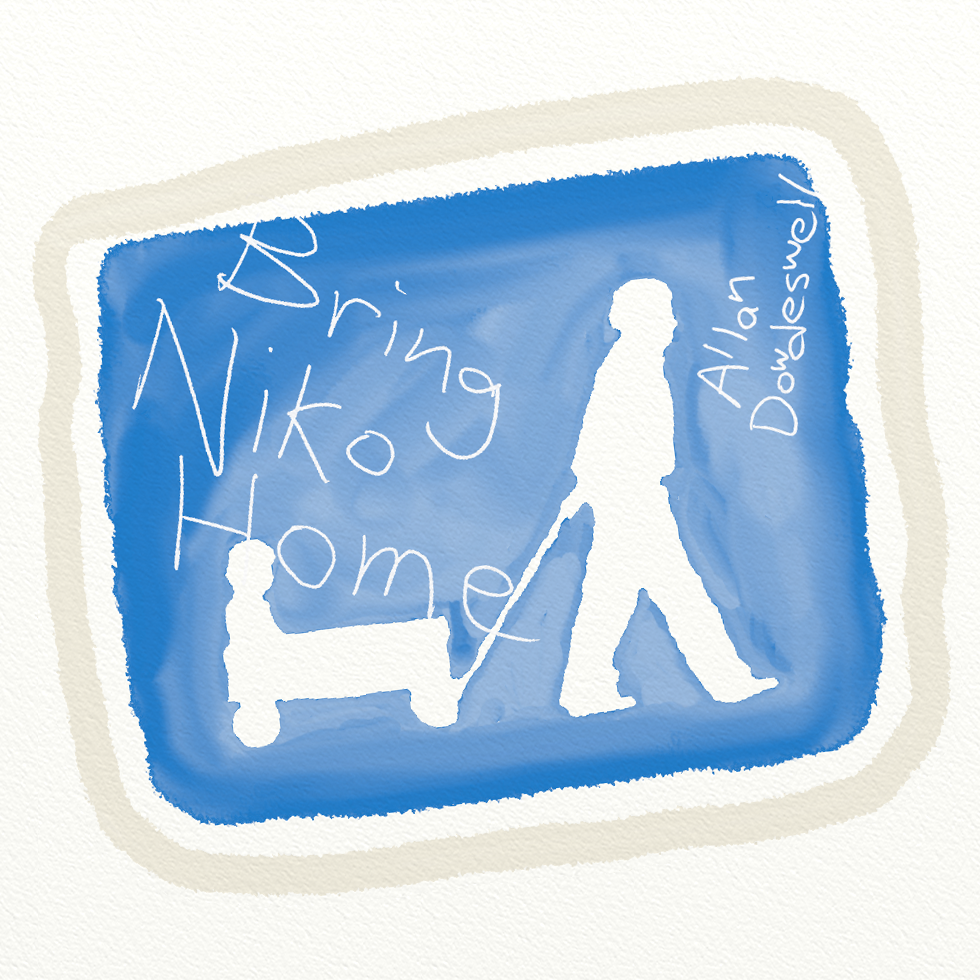
This was a personal project for raising funds as our family planned to adopt our son from overseas. Allan recorded a collection of songs and offered them for free download in hopes that people would give money towards our goal. The songs are still available at the time of this writing. Please, only laugh at the funny ones!
2013 Shelterbelt Design Tool
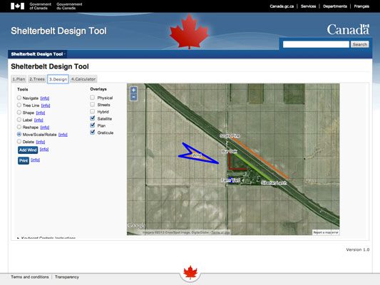
If you ever wondered how many trees you needed to plant in a half mile row, this was the application for you! Once again it was very satisfying to bring together different code toolkits and unite them using the Haxe language. Accessibility was an essential feature and it was necessary to use the Canada government’s WET-BOEW framework, sprinkled with some JQuery and OpenLayers for the maps. The whole tool could be used solely with keyboard entry if the user needed.
2013 Ajax & Me
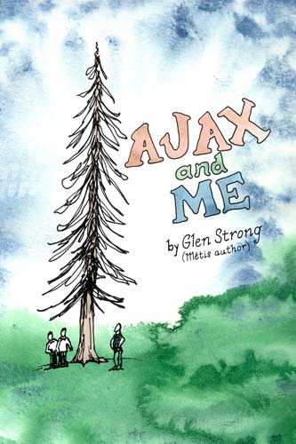
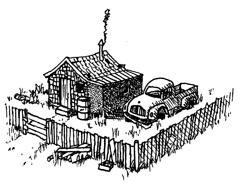
We did design, editing and layout for this interesting youth-market book. We convinced the publisher that having illustrations for each chapter would make it more appealing, and Allan got his first opportunity to be a professional illustrator!
2014 Lentil Hunter Map
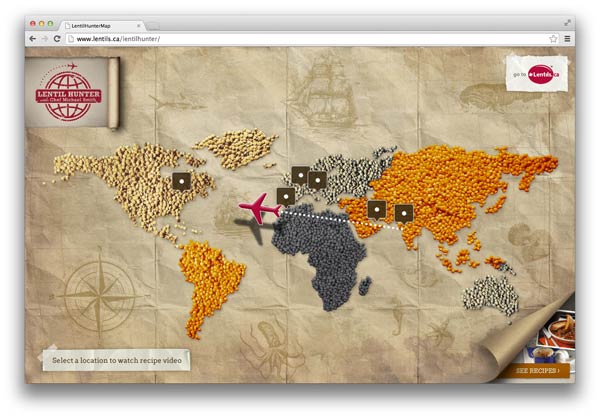
An interactive map that displays videos! We compiled both Flash and HTML5/Javascript from the same Haxe code so that we could have maximum compatibility.
2015 X-110 Protein Snacks
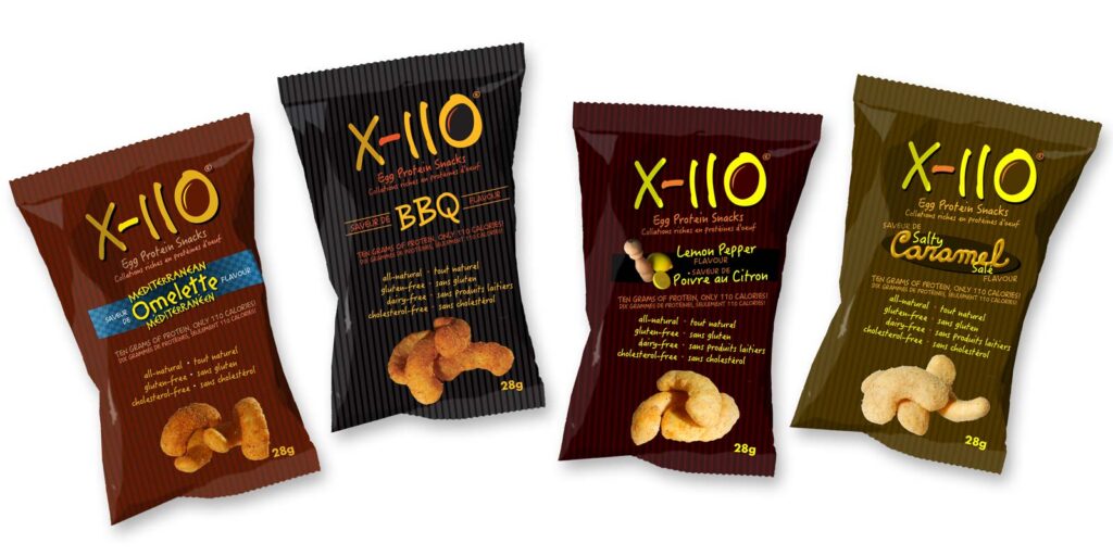
The client needed assistance in both naming their product and creating a branding program to include packaging, display, print, and web. We did product photography and even hand-built display modules as required.
2016 SAS Design Standards Guide
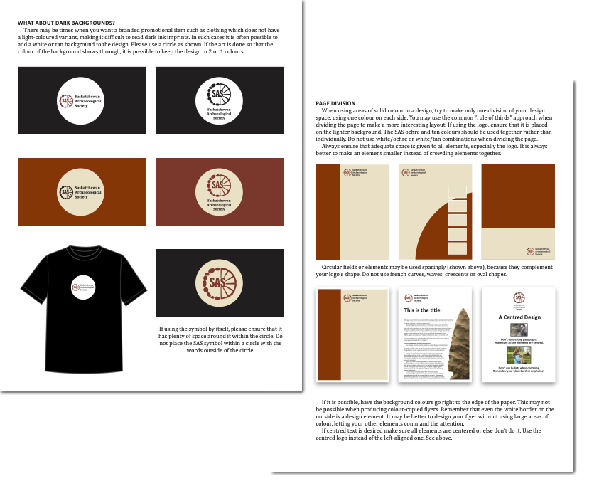
The Saskatchewan Archaeological Society had a new logo they produced, and needed some guidance on how to best use it. We produced this document for their internal use.
2017 Play Poster and Elevators Awards Colouring Book
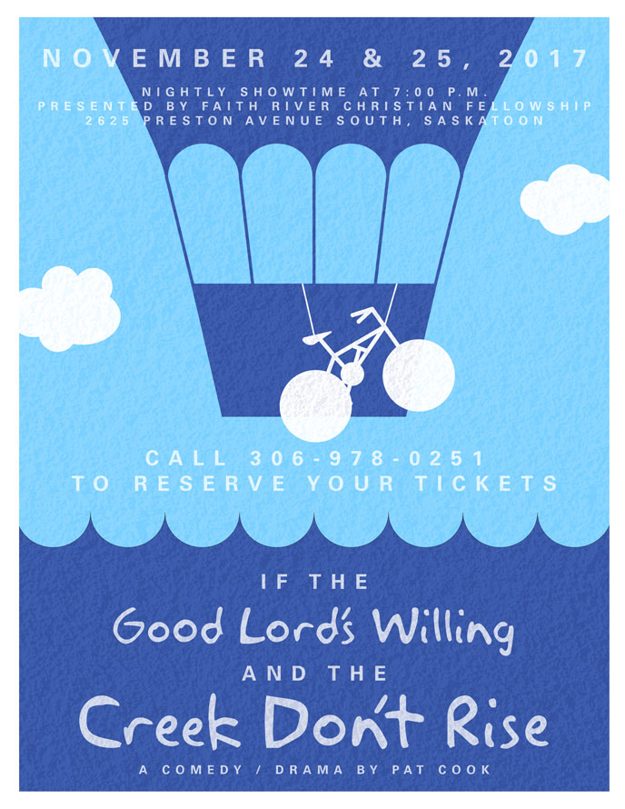
Pro bono projects are always a fun opportunity to push the creative limits a bit! In other news, I was the villain in the play and got to display my panic attack skills!
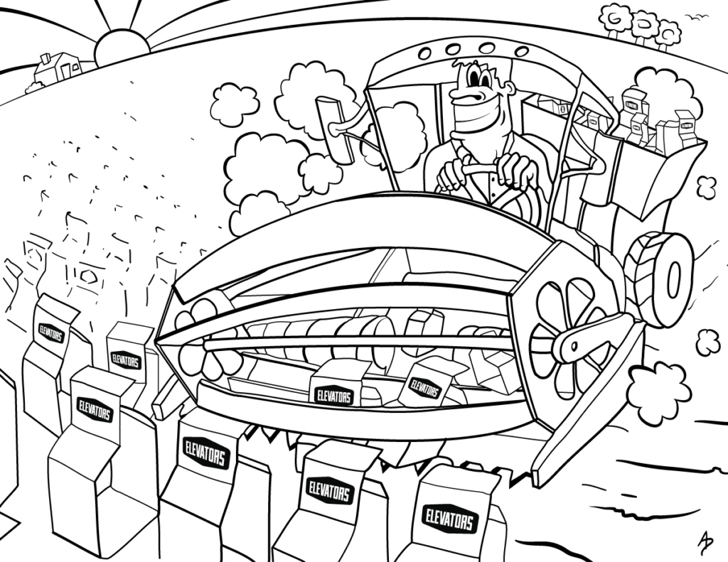
The Graphic Designers of Canada put together a colouring book themed awards show that year. This was my contribution.
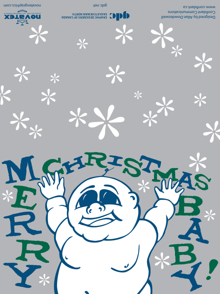
2018 GDC Christmas Cards
The Saskatchewan North chapter of the Graphic Designers of Canada (now DesCan) and their generous sponsors Novatex produced a series of Christmas cards. I jumped at the chance to do some screen printing design again, since it was a long time since I worked as a screen print designer and printer in 1995 and 1996.
2019 RTA Kitchen Design Tool
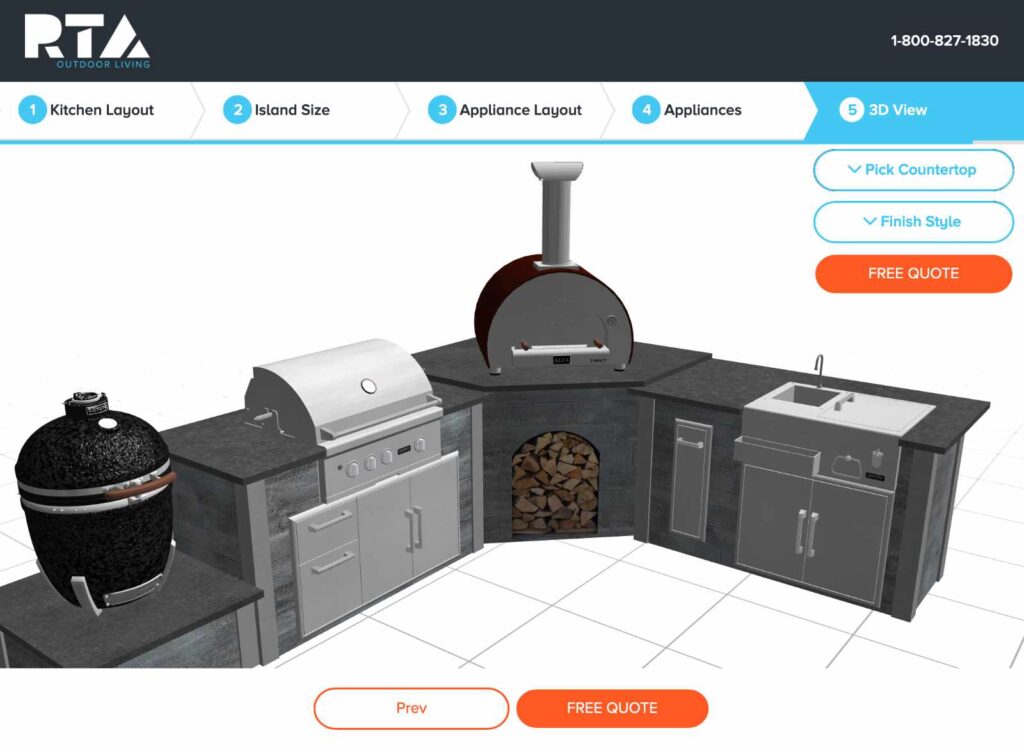
This was a fantastic opportunity to expand Confidant services into the realm of 3D visualization and full-stack application development. Using Haxe, OpenFL, FeathersUI, Away3D and our own Glory Framework. Behind the scenes we leverage PHP, Docker, HashLink and Node.js.
2020 Fahselt Overhead Door Logo Clean-up
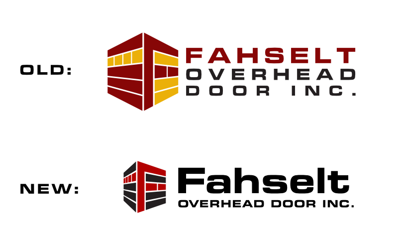
I did a lot of technical work that year, so it’s always nice to get some design work. Don’t crowd-source your logos, folks! Pain! Suffering!
2021 Amity Trust Website
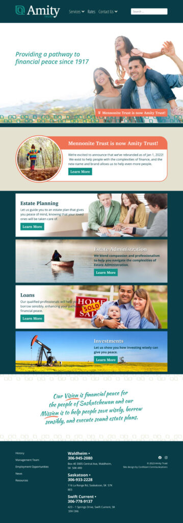
Amity had an attractive new branding program. After advising on some letter-spacing issues in their logo I designed their new Joomla! website to complement their new design and work tightly with their page builder component.
2022 Prairie Kettle Corn
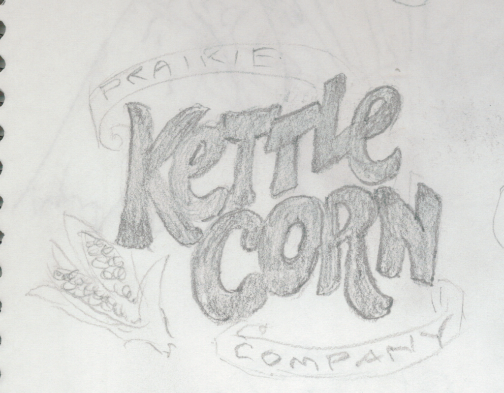
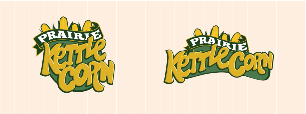
This was one of those designs where I did something that was sort of good but I revisited it after a couple days and made it way better.
2023 Augmented Reality
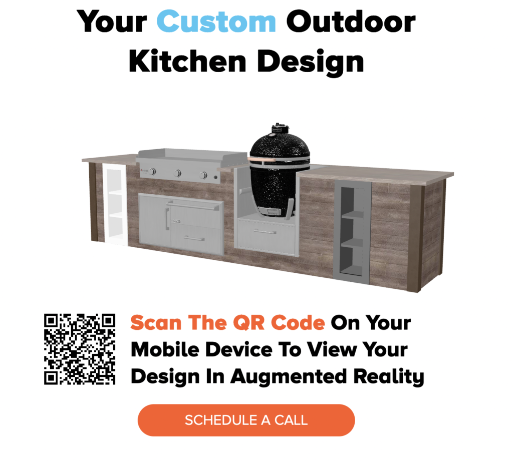
This was the year Confidant did our first launch into augmented reality, adding it to the RTA Kitchen Design Tool.
2024 Three.js and a big thing for Joomla!
That brings us to today. My efforts this year have been towards building more 3D graphic technology, this time using Three.js because of its native support for augmented reality. I also started a big top-secret side project for Joomla! Watch this space for more details on that!
Thanks for reading, we look forward to what the future holds!