
We have had conservative leadership both in our province and our country for a few years now, with mixed results. I will try not to trumpet my own political views but I feel the need to speak up about a recent action by the Saskatchewan Party.
For you non-Saskies out there, you should know that we have a very nice logo that in recent years has fell out of usage, apparently because its strong agricultural imagery is no longer representative of our overall industry outlook:

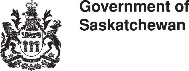
When it was first proposed that we develop a new logo, the idea was met with a fair bit of resistance. So for a while, the province resorted to using our coat of arms:
I thought this was a fine compromise. However, in recent years the Saskatchewan Party leadership has quietly begun using the logo below (I found versions in a number of colour variations):

While I could comment on the low-key methods they used to introduce the logo, my main issues are with the design itself. I believe in constructive criticism, so instead of just slamming it point by point, let me show you how I would fix it.
1. Let’s clean up that type shall we? Put the “of” back to a subservient role where it belongs, and go back to good old Helvetica.
![]()
2. What are those swooshy things? People flying right over our province, that’s what. What we need here is to change the swooshes to come from within the province. That way we can be known as a fountain of sorts. We export all sorts of good things, so let’s show it.
![]()
3. I think we need more swooshes and more symbolism. Let’s put in some growy-looking shapes that are reminiscent of the old sheaf logo, and a sun rising.
![]()
4. Green and gold? Identical to the ruling party’s colours? Come on. We are the “Land of Living Skies” (if our license plate is to be believed) so why not use a palette which is reminiscent of a nice sunset:
![]()
There you have it: a properly designed, party-neutral logo that properly represents our thriving province. I am against spec work, by the way, so if you want to use this logo you will have to elect me as the leader of some rival party and then vote me into office based on my other merits. If elected I propose that we institute the new identity on April 1, 2015.
Ahem, happy first of April everyone.