
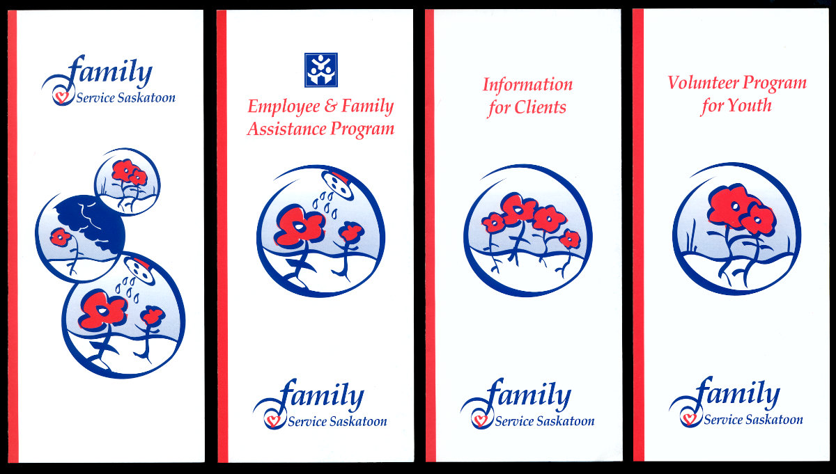
Family Service Saskatoon Brochures
The client had older brochures which told about their programs, but the illustrations they used were too literal and tended to be depressing. Our designer developed this new illustration style around plant imagery so that FSS could have the freedom to “get serious” while maintaining a friendlier feel which was consistent across their series of brochures and complimented their logo.
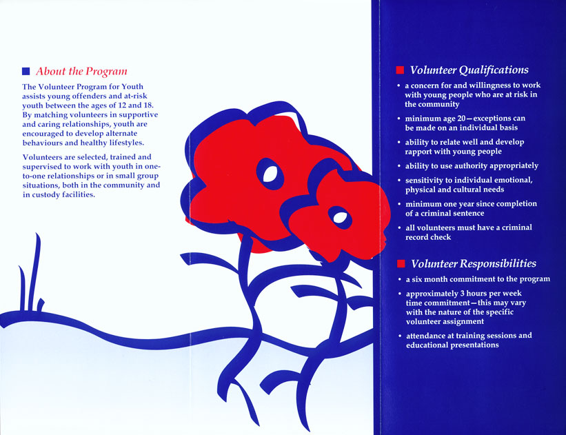
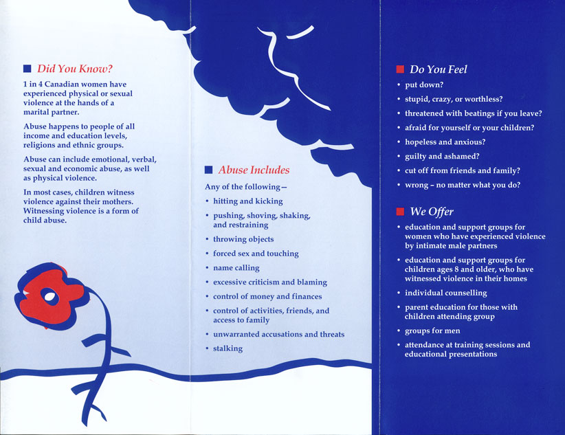
To save printing costs, the designs were executed using two spot colours. The client was very happy with the end result!

